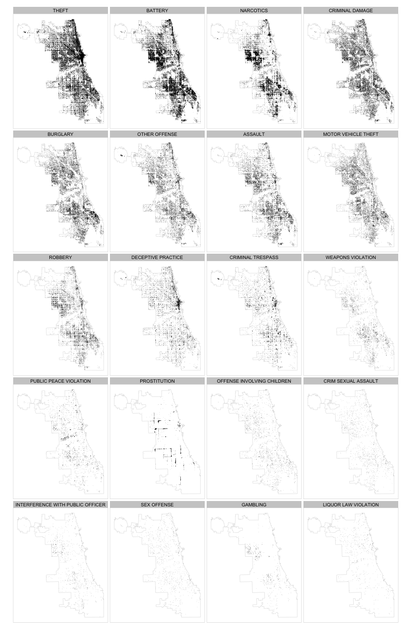
I’ve been using R to analyze Chicago crime data. It took me quite a while of tweaking to get the view I wanted, but I learned some things about plotting spatial data using ggplot2 that I wanted to share.
If you want to follow along, you will need to download the Chicago city boundary shapefile as well as the 2011 crime data. You’ll also need the maptools, rgeos and plyr packages, in addition to ggplot2.
Shapefiles
First, there are lots of R packages for handling spatial data and many different ways to read Shapefiles and plot them. In the end, I figured out how to get map tools and ggplot2 working together.
1 2 3 | |
We’re doing a few things to the data we read in. First is that we are simplifying it using gSimplify. The original Shapefile from the city is very detailed and has over 12,000 points in it. For our simple plotting purposes, that is overkill. The coordinates are in feet, so we are are giving a tolerance of 100 feet.
Second, we are fortifying the polygon data so ggplot2 knows how to group the spatial data. The Chicago boundary actually has holes in it - areas enclosed by the city that are not part of the city proper. The Shapefile therefore has multiple paths in it. If you try to plot the data without grouping it, ggplot2 will draw ugly lines connecting all those paths. You also need fortify when you have multiple regions in your data and want to plot them with different aesthetics.
Finally, the Shapefile is in X/Y, not lat/lon, but fortify creates the names long and lat, so we change them to avoid confusion.
Data Prep
The data itself needs a little bit of cleaning. It would need quite a bit more for different types of plots, but we are only interested in plotting by crime type so that is what we’ll focus on.
1 2 3 4 5 6 | |
The first thing we do is normalize the names of the primary crime type category. Then we use some manipulation tools from plyr to order those by descending frequency of occurrence in the data. Creating the factor this way helps order our plots when we facet them later.
Plotting
Now we are ready to plot our data.
1 2 3 4 5 6 7 8 9 10 | |
A few things to point out. First, the ordering we did of the Primary.Type factor now lets us look at a desired range of crime types by rank with subset and facet_wrap. Second, the crime data has both X/Y coordinates and lat/lon, but we are using X/Y to match the Shapefile coordinates. Finally, no_grid_opts isn’t shown, but makes our facet grid more readable.
Now we can generate plots like below. The spatial distributions are fascinating. Some types clearly have greater prevalence at intersections, bus or train stops, or along streets - prostitution being the most striking of these. Others seem to have regional clusters like narcotics and gambling. You can see that theft is very concentrated in the downtown area, but narcotics and burglary are not.

This just scratches the surface of what you can do with this data set but I hope that is enough background so you can dig into the other parts as well.
The full gist is available here.