I’ve been slowly migrating from R to Python for new data analysis tasks. In particular, learning pandas and ŷhat’s port of ggplot to Python. I’m coming a little late to the party, but the Divvy Data Challenge completed recently to award prizes for visually compelling analysis of anonymized data from Chicago’s new bike share service. New York’s new bike share program has been in the news recently, highlighting ‘financial and operational challenges’ and implying the problem stems from low purchases of daily pass sales. The chart the Journal uses to support that claim is almost a textbook case of making the chart fit the story you want to tell rather than making a chart reflect the data. They plot weekly pass purchases vs. weekly cumulative membership numbers to make an apples-to-oranges comparison instead of something more sensible.
The story got me thinking about what real operational differences might exist between New York and Chicago. Digging into that was interesting in its own right, and it helped me better understand pandas compared to R.
Revenue model
The anonymized data divides users into two different types, Subscribers (those who purchase yearly memberships) and Customers (those who purchase daily or weekly passes). The Journal article states that the New York program has seen more Subscribers than expected, but fewer Customers than expected and that is a problem since Customers provide the “potential for far greater revenue”. We’ll take that at face value first and try to explore Customer revenue.
The anonymization process only provides trip data. Importantly, we don’t know which trips were associate with which passes. The winner of the Most Insightful category for the Chicago challenge attempts to track “connected” trips, those where a user is docking the bike momentarily to avoid overtime fees. That analysis indicates connected trips make up between 10% and 15% of all trips. But that doesn’t tell us the whole story about how many trips may be made in a whole day on a single pass. So we make the simplifying assumption that Customer revenue is proportional to Customer trips.
Cost model
On the cost side, there are a number of factors, but we can roughly categorize them into two (somewhat fuzzy) buckets, one related to capacity and one related to availability. The stations, docking slots and bikes are all costs proportional to system capacity. In other words, the more weekly unique users of the system, the more of these items are needed. Since the anonymization process does not provide customer-specific information, we don’t have unique customer counts to compare capacity costs between the two markets. As described in this fascinating article, bike demand is not the same at each station. The availability part of the costs incurred are related to “rebalancing” the bikes so stations have appropriate numbers of both bikes and open slots for users. For Customers, the lack of availability can lead directly to lost revenue (they likely wouldn’t purchase a pass at an empty station). Rebalancing is something we can glean from the data, so we’ll make the simplifying assumption that costs are proportional to rebalances.
Revenue analysis
So the first thing we’ll look at is Customer trips.

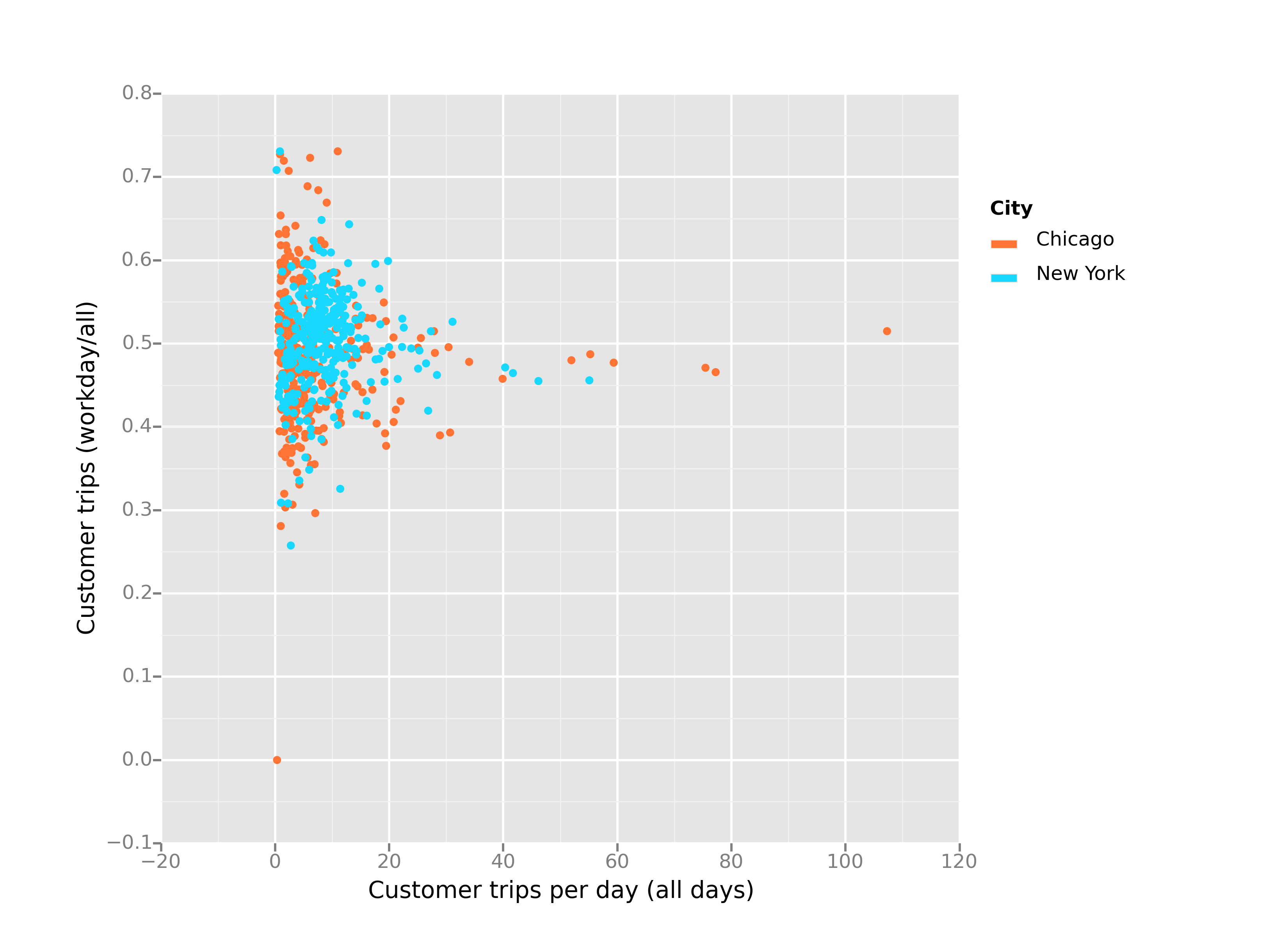
The chart above shows a dot for each station. It shows that stations in both cities are roughly equal in usage, with Chicago having a few more high-use ones (the ones off to the right). Those happen to be Streeter Dr & Illinois St (Navy Pier), Lake Shore Dr & Monroe St (on the Lakefront Trail near Millennium Park), and Millennium Park itself.
It also shows that both cities have a roughly equal breakdown between workday usage and non-workday trips. But since there are more workdays in the week, this means the systems are much more active during the weekends and holidays.

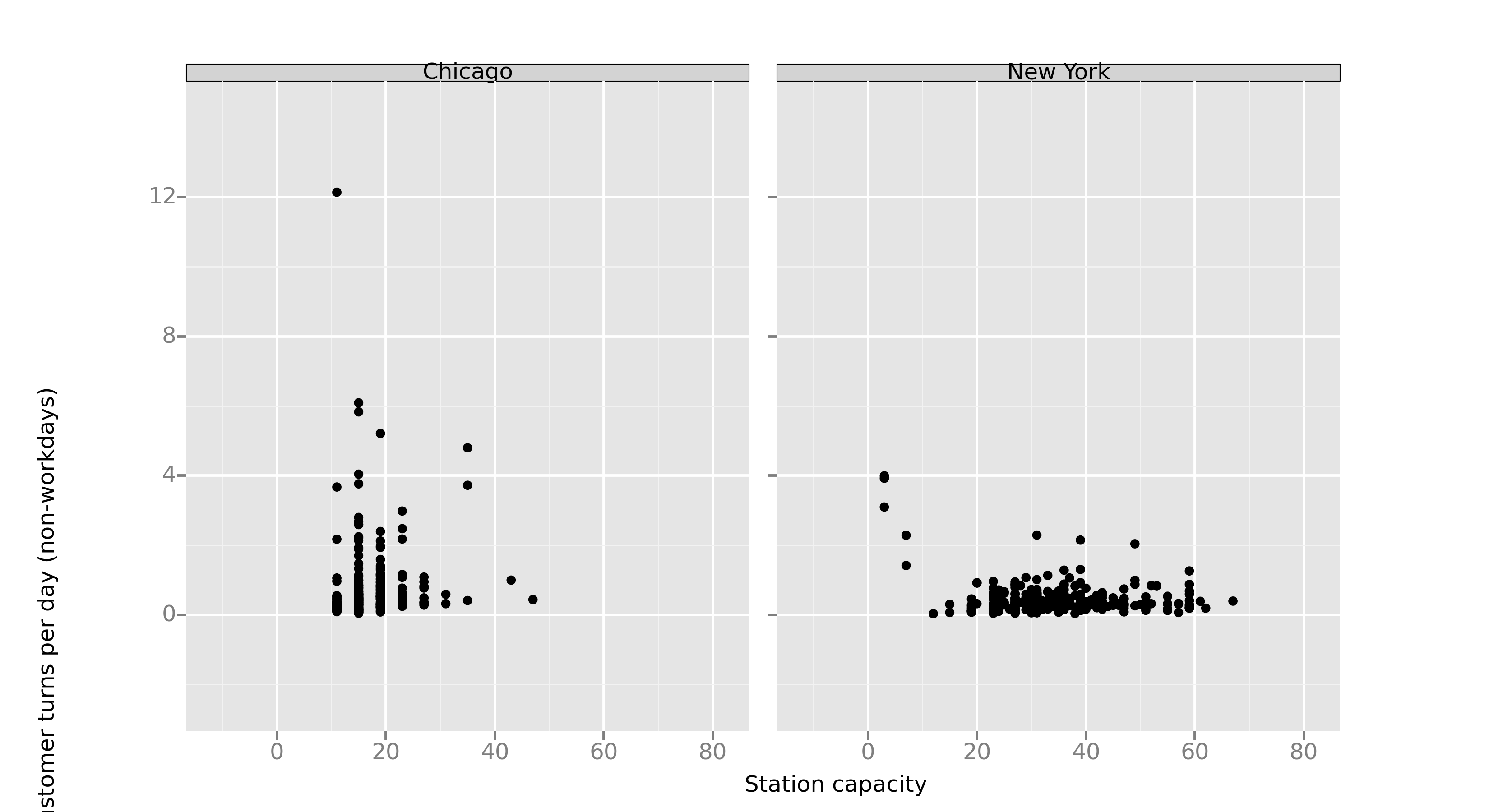
If we use a restaurant analogy, we can track how often a station “turns over” its capacity of bikes. If a station has 20 slots and averages 20 outgoing Customer trips a day, we’ll say it averages 1 “Customer turn” per day. The plot above shows the turnover rate and capacity of each station.
A couple things jump out about this chart. One is that Chicago stations are set up in one of just a few different sizes. New York seems to have much more diversity in station sizes. New York also tends to have more larger stations with less turnover. But it is a little difficult to figure out if one is worse than another. Maybe New York’s bigger stations were just planned for higher usage (as the Journal article implies). The Journal article also talks about how rebalancing is very difficult in New York due to traffic. Again, maybe the stations were sized with this in mind - larger stations so the stock will last longer. The Chicago station with over 10 turns is the one on the Lakefront Trail at Lake Shore Drive and Monroe. You could look at this chart and think it needs to have a much larger capacity, but lets look at rebalancing activity as well.
Cost analysis
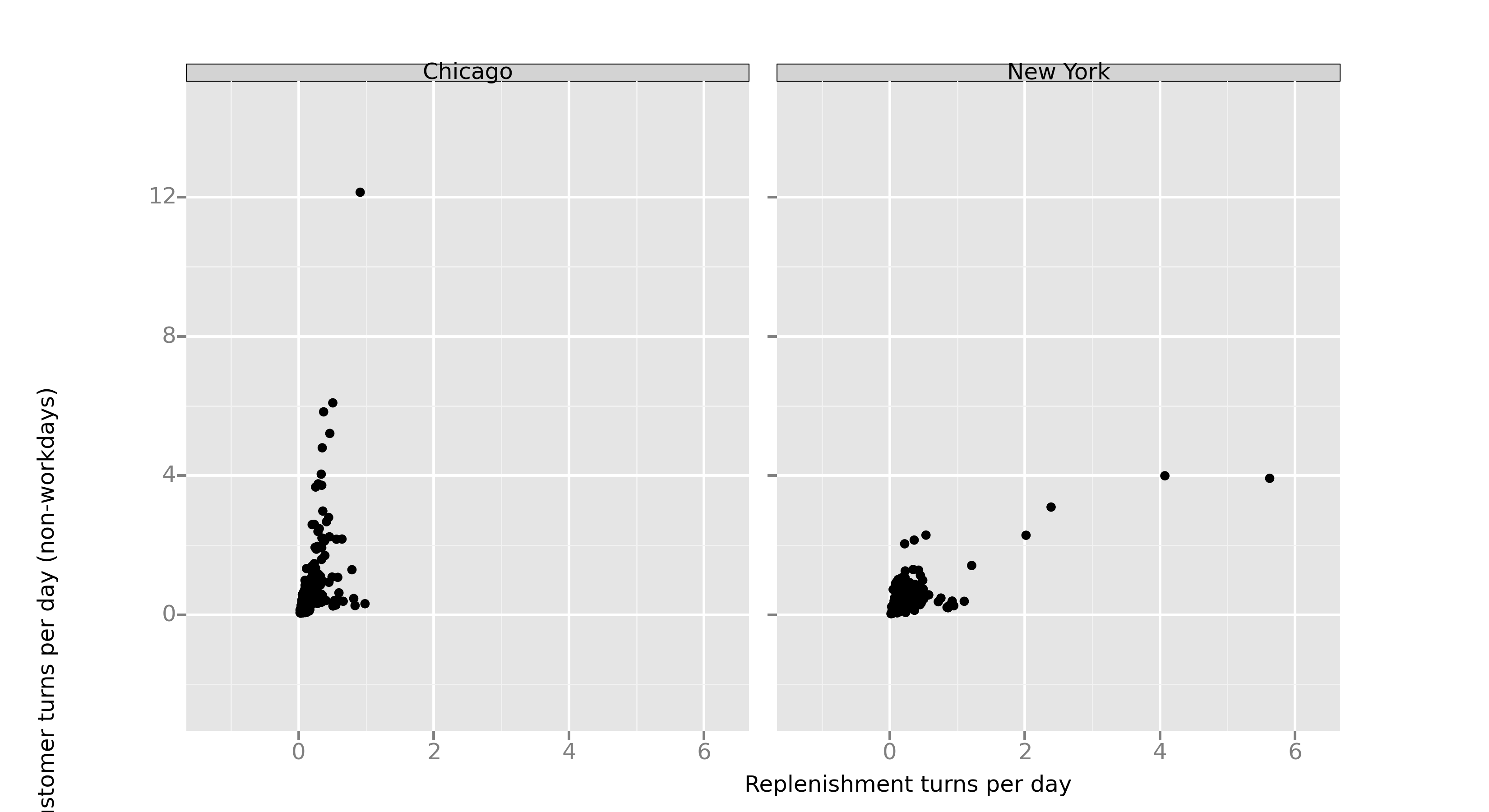
We can detect rebalance activity in the data when a bike ends a trip at one station, but begins it’s next trip at a new station. This means the operator has moved it instead of a user riding it. We don’t know exactly when those moves were made, we only know the surrounding user trip times. That means we can’t easily categorize a rebalance in terms of “workday” and “non-workday”. Consequently, we are counting rebalances from all days and we only care about rebalances into a station since those are the ones that most directly relate to potential lost revenue opportunities. We’ll call these incoming ones “replenishments” and again normalize them with respect to station capacity to get replenishment “turns”. So for a station with 20 slots, a replenishment turn rate of 1 means that, on average, the operators need to bring 20 bikes a day from other stations to that station to satisfy the availability needs.

So now we can see that the Lakefront Trail station at Lake Shore Drive and Monroe is not necessarily sized incorrectly. In fact, it looks like a “cash cow”. A station in the top left quadrant means that many customers per day are originating trips (in our simplified analysis, that means it brings in more revenue), but the operators don’t need to spend significant cost to make those bikes available. That kind of makes sense for such a spot on a beautiful bike path along Lake Michigan with enormous parking garages under the nearby parks. Stations in the bottom right quadrant, on the other hand, drag on profit. They require more cost from the constant replenishment of bikes, but don’t result in higher revenue from the relatively low turnout of day-pass customers. Unfortunately, New York stations skew to the (less-profitable) bottom right while Chicago stations skew to the (more-profitable) top left.
Overtime fees
There is one more part of the profitability equation to look at and that is overtime fees.
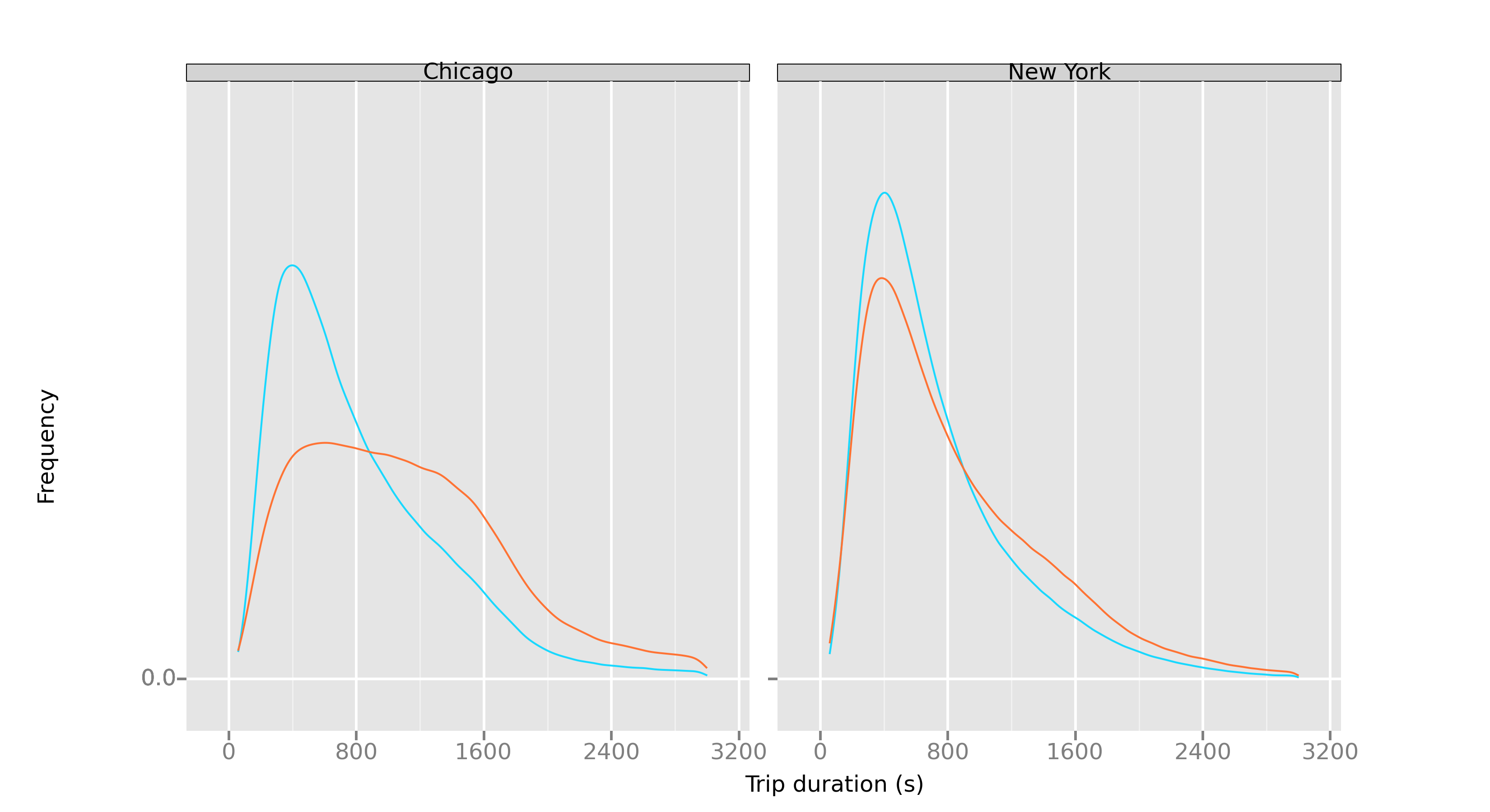
Both Customers and Subscribers pay overtime fees for rides over a certain duration. In Chicago, fees kick in for rides over 30 minutes and in New York they kick in for Customers at 30 minutes and 45 minutes for Subscribers.

The chart above shows again that the behavior in New York and Chicago is very different. We’re showing all user types since the fees apply to everybody. Python ggplot is acting up by not showing the legend, but the blue lines are workday trips and the orange lines are non-workday. It basically shows that weekends and holidays in Chicago lead to different behavior. People take longer trips and therefore incur larger fees. People in New York don’t seem to kick back and enjoy a long, leisurely ride on the weekend. The non-workday profile there is pretty similar to the workday one. Do the day-pass purchasers in Chicago really have different personalities than the same purchasers in New York - or do the respective city layouts and/or station locations cause the different behavior?
There are certainly more nuts to crack to figure out how to make New York more profitable. The analysis makes me wonder if the profitability of a bike share is partially an inherent property of the city. There might be something to the Journal’s assertion that tourists are the main issue in New York, but it seems like there is something more to the story. Station placing and sizing seem to be important and seem to require an understanding of the attractions within the specific city and the expected bicycle-specific usage patterns at those locations.
The code to reproduce these is pretty straight-forward. The fundamentals are in this gist. As you can see from some of the labeling issues on the plots, Python ggplot has a little ways to go still, but I was pleasantly surprised at how relatively painless it was to migrate my analysis and plotting knowledge from R to Python.